Written by Paul Worrall
Nature has been the single most enduring subject in art history — longer-running than portraiture, longer than abstraction, longer than almost any movement you could name. What’s genuinly interesting, if you spend enough time around art materials the way I have, isn’t just what these artists painted or built, but what they actually used to do it. The materials tell you as much about an artist’s approach as the finished work does.
I’ve spent 16 years in the UK art supplies industry and now run Discount Art Supplies, used by over 36,000 UK artists every week. Here’s a look at some of the most celebrated nature artists in history, and the materials and techniques that actually shaped their work.
John James Audubon — Watercolour and Naturalist Illustration
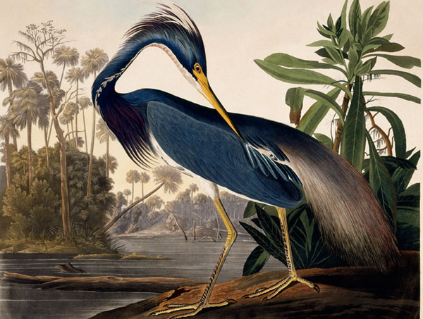
Audubon’s “The Birds of America” remains one of the most significant works of natural history illustration ever produced, and the materials behind it were surprisingly direct — watercolour, graphite, and occasionally pastel, worked over careful preliminary sketches taken from freshly killed specimens he’d study and pose. The scale of the finished plates (many life-sized, some birds spanning several feet) meant working on large sheets of heavyweight paper, blending watercolour washes with fine detail work for feathers and texture.
For anyone drawn to detailed natural history illustration today, the same fundamentals apply: quality watercolour paper substantial enough to handle repeated washes without buckling, and a full range of fine brushes for detail work alongside broader ones for washes. Our guide to the best watercolour paper for artists covers the modern equivalents.
Beatrix Potter — Botanical and Wildlife Watercolours
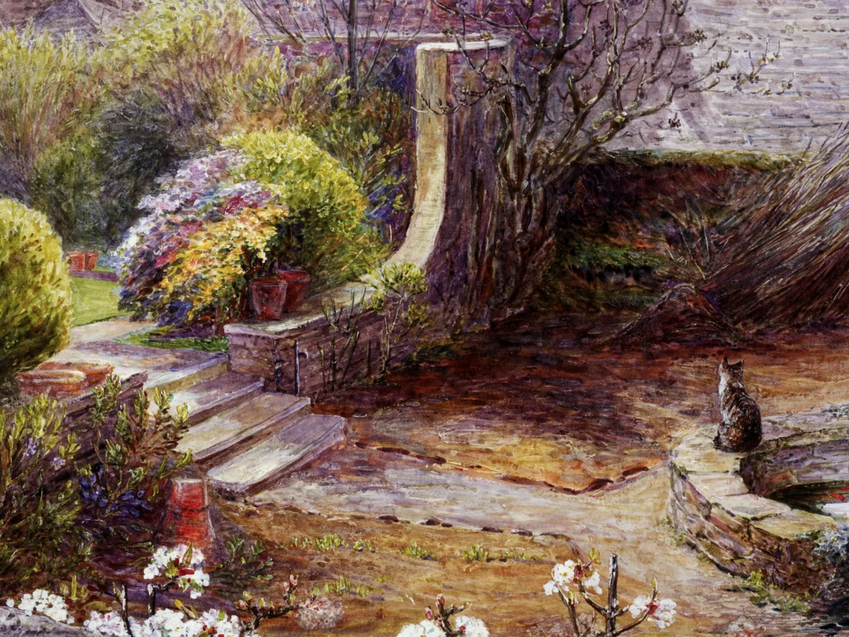
Long before Peter Rabbit, Potter was a serious and genuinly skilled botanical and mycological illustrator, producing detailed watercolour studies of fungi that were taken seriously enough to be presented to the Linnean Society. Her technique relied on precise, controlled washes and fine detail brushwork, built on careful observational drawing done directly from specimens rather than from memory or reference.
The discipline in her botanical work — accurate, restrained, built from direct observation — is a good model for anyone starting out in nature illustration. It’s less about dramatic technique and more about patient, accurate looking, translated through a controlled watercolour palette and a genuinly steady hand.
The Lake District is somewhere close to my heart, and we took the kids up with Lucy last year to visit Potter’s old house at Hill Top — a genuinly lovely sunny day, and there’s something quite special about standing in the actual rooms and garden that shaped so much of her work. Small world moment: a mate of mine, Andy, who plays alongside me in a band called The Keytars, is an alarm engineer and has spent the past few months working on-site at the Beatrix Potter house — it’s funny how often this industry crosses paths with people you already know.
Georgia O’Keeffe — Oil Paint and Magnified Nature
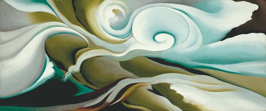
O’Keeffe’s large-scale flower paintings and New Mexico desert landscapes took a completely different approach to nature — bold, magnified, simplified rather than detailed. Working primarily in oil paint, she built up smooth, blended surfaces with minimal visible brushwork, favouring clarity of form and colour over textural detail.
Her approach shows how differently “nature art” can be interpreted — where Audubon and Potter worked in fine, accurate detail, O’Keeffe abstracted and enlarged, using oil paint’s blending capability to create soft, almost sculptural colour transitions. For artists drawn to this bolder, more interpretive style, a good range of professional oil paints and blending mediums matters more than the fine brushes suited to detailed illustration. Our guide to oil paints for beginners is a sensible starting point.
Andy Goldsworthy — Land Art and Natural Materials
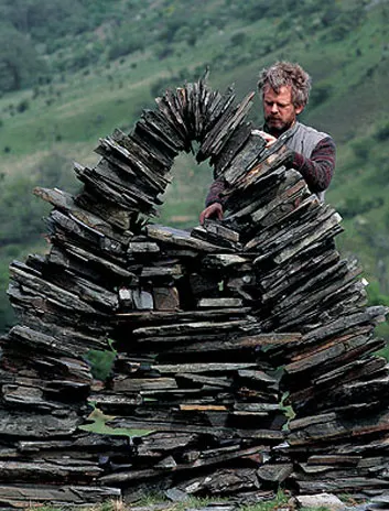
Goldsworthy takes the idea of “nature artist” furthest from a traditional studio practice — his work is built directly from natural materials themselves: ice, leaves, stone, twigs, arranged into striking temporary sculptures and installations, then documented through photography before they’re reclaimed by the elements. There’s genuinly no paint or canvas involved at all in most of his best-known work.
What connects Goldsworthy to the more traditional painters on this list is the same quality of close observation — understanding colour, form and the specific properties of natural materials well enough to compose with them directly. For anyone interested in this end of nature art, the “materials” are the outdoors itself, though photography equipment to properly document ephemeral work becomes the practical tool that matters most.
Emily Carr — Bold Colour and the Canadian Landscape
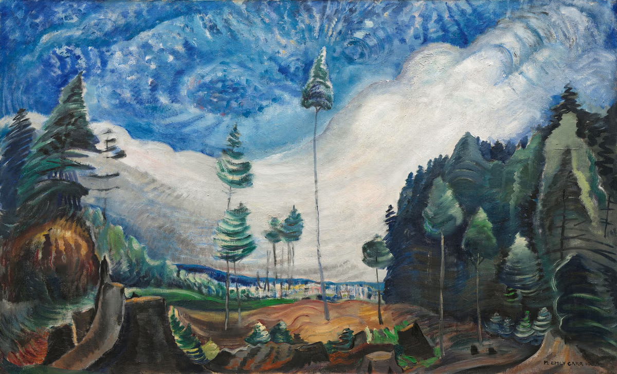
Carr’s paintings of British Columbia’s forests and Indigenous villages used bold, often unconventional colour and confident, expressive brushwork rather than naturalistic accuracy — closer in spirit to the European Post-Impressionists she’d studied than to traditional nature illustration. She worked extensively in oil, and later developed a distinctive technique using oil paint thinned with petrol on paper, allowing faster, looser work suited to her prolific output.
Her example is a good reminder that “nature art” doesn’t have to mean careful realism — expressive, confident colour work can capture a landscape’s atmosphere as effectively as precise detail, sometimes more so.
Charley Harper — Stylised Wildlife Illustration
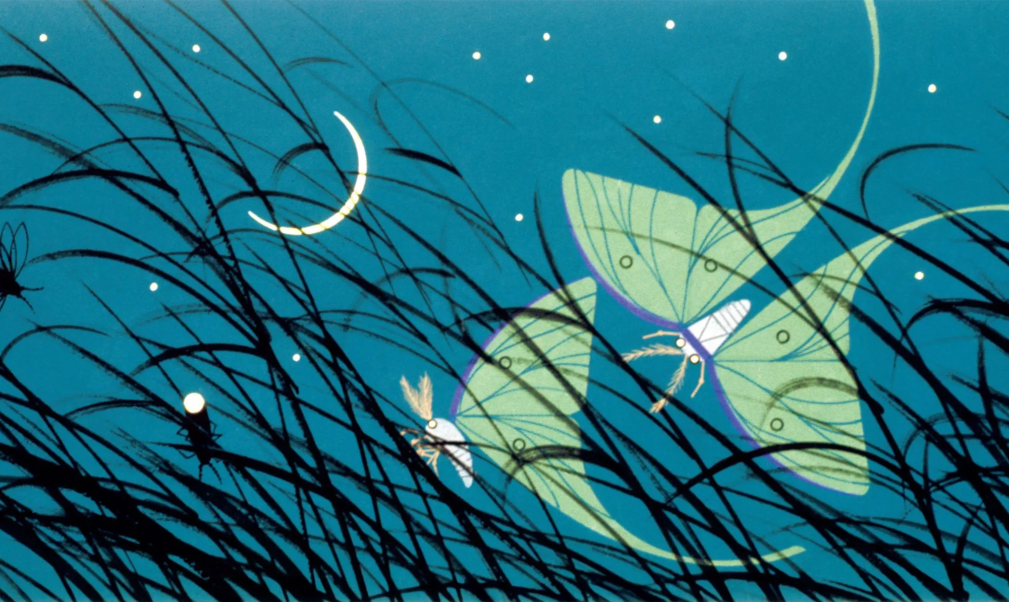
Harper took nature illustration somewhere genuinly distinctive — simplified, geometric, almost graphic-design-like representations of birds and wildlife, built from flat colour shapes rather than naturalistic shading. His technique relied on gouache and later screen printing, favouring bold, clean colour blocks over blended tones.
For artists drawn to a more modern, stylised approach to nature subjects rather than photorealistic detail, Harper’s work is proof that simplification can be just as compelling as accuracy — and gouache’s flat, opaque colour is well suited to that kind of confident, graphic approach.
What This Means for Your Own Nature Art
The common thread across all of these artists, whatever their individual style, is that the materials were chosen to suit the approach rather than the other way round — fine watercolour for accurate detail, oil for blended richness or bold expression, gouache for flat graphic colour, and in Goldsworthy’s case, no traditional materials at all. Working out which of these approaches actually matches how you want to depict nature is worth doing before committing to a particular medium.
Whatever direction you take, our paints and mediums deals page and canvas and paper deals page compare current prices across the major UK art retailers, so whichever material you land on, you’re not paying more than you need to.