Written by Paul Worrall
Phthalo green and phthalo blue are two of the strangest pigments on any artist’s palette — genuinly stronger, more staining and more misunderstood than almost anything else you’ll find in a paint range. Every major brand makes a version of them, most artists own at least one, and yet the way they actually behave in a mix trips up beginners constantly. This is the full picture: where they came from, what actually differs between the versions, how they behave across different media, and how to stop them taking over every mix you make.
I’ve spent 16 years in the UK art supplies industry and now run Discount Art Supplies, used by over 36,000 UK artists every week.
Where Phthalo Pigments Come From
Phthalocyanine pigments are synthetic organic compounds built around a copper-based molecule, first brought to market in 1935 under the trade name Monastral Blue — a name a few paint manufacturers still use today. When it launched, it was considered the biggest advance in pigment chemistry since synthetic Ultramarine arrived over a century earlier, and that reputation has genuinly held up. It’s now one of the most widely used blue and green pigments in the world, well beyond art materials — it’s in printing inks, industrial coatings, and even certain toothpaste colourants.
The whole phthalo family shares three defining traits: they’re highly transparent, extremely staining, and reliably lightfast. Those three qualities together are what make them both so useful and so easy to misuse.
Quick Reference — The Phthalo Family
| Pigment | Colour Index | Temperature | Best For |
|---|---|---|---|
| Phthalo Blue, Green Shade | PB15, PB15:3 | Cool | Split-primary cool blue, sharp greens |
| Phthalo Blue, Red Shade | PB15, PB15:1 | Warm | Dark warm values, natural greens |
| Phthalo Green | PG7 | Cool, deep blue undertone | Seascapes, turquoises when tinted |
| Phthalo Green, Yellow Shade | PG36 | Warm, yellow undertone | Clean emerald greens, landscape work |
| Phthalo Turquoise | PB16 (single pigment) or PB15/PG7 mix | Cool | Standalone turquoise, complements orange-reds |
Naming varies between brands — always check the pigment code (e.g. PB15:3) on the tube rather than relying on the colour name alone, since “Phthalo Blue” without a shade specified is usually, but not always, the green shade.
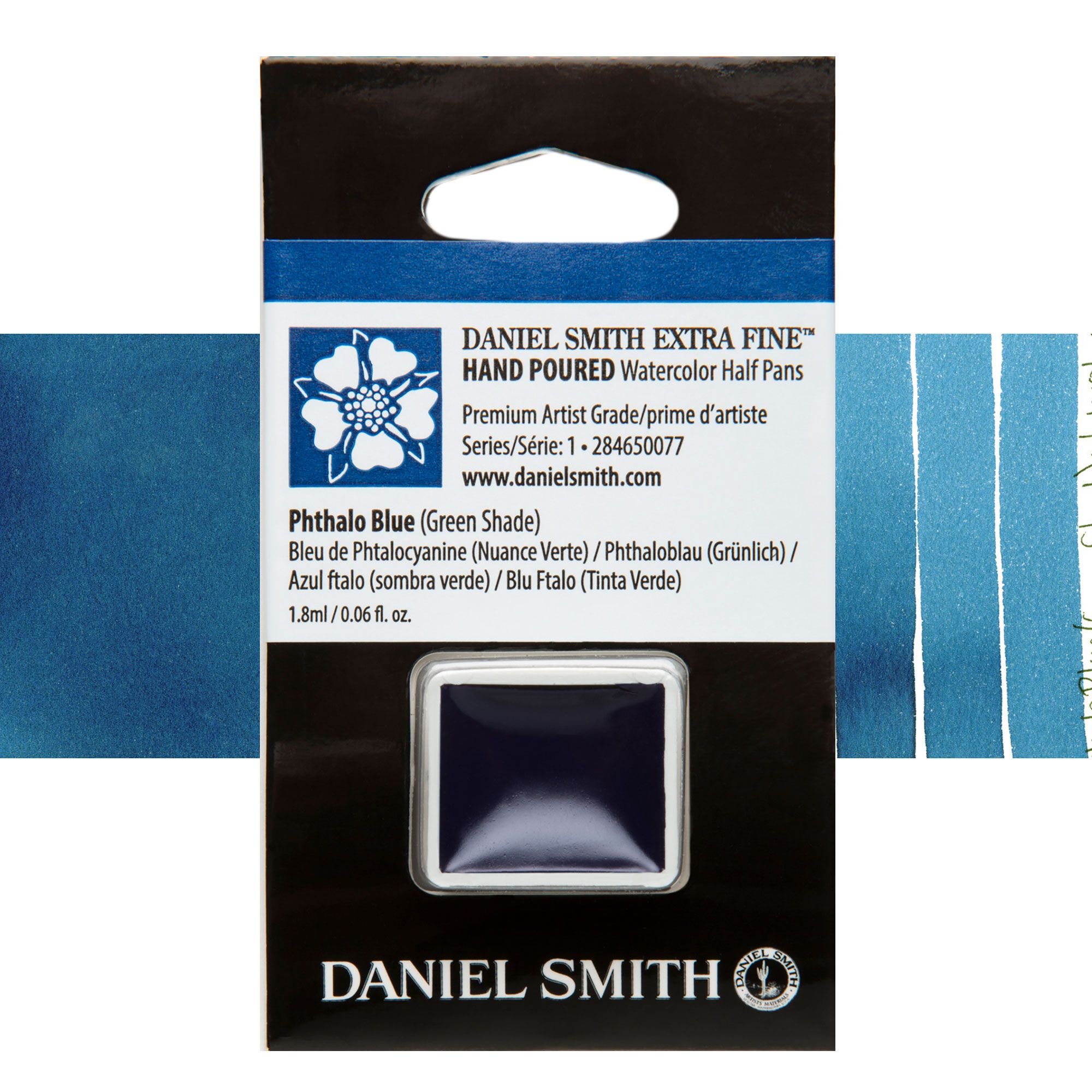
Phthalo Blue, Green Shade (PB15, PB15:3)
This is the default most people picture when they think “phthalo blue.” Cool in temperature with a distinct green undertone, it’s a strong choice for a cool blue in a split-primary palette. Mixed with an opaque, high-tinting red like Cadmium Red, it produces a strong, semi-transparent near-black. With a cool yellow it makes sharp, vibrant greens, and thinned right down with white, it approaches something close to Cerulean Blue — useful for watercolourists who like Cerulean’s softness but want a non-granulating alternative.
Phthalo Blue, Red Shade (PB15, PB15:1)
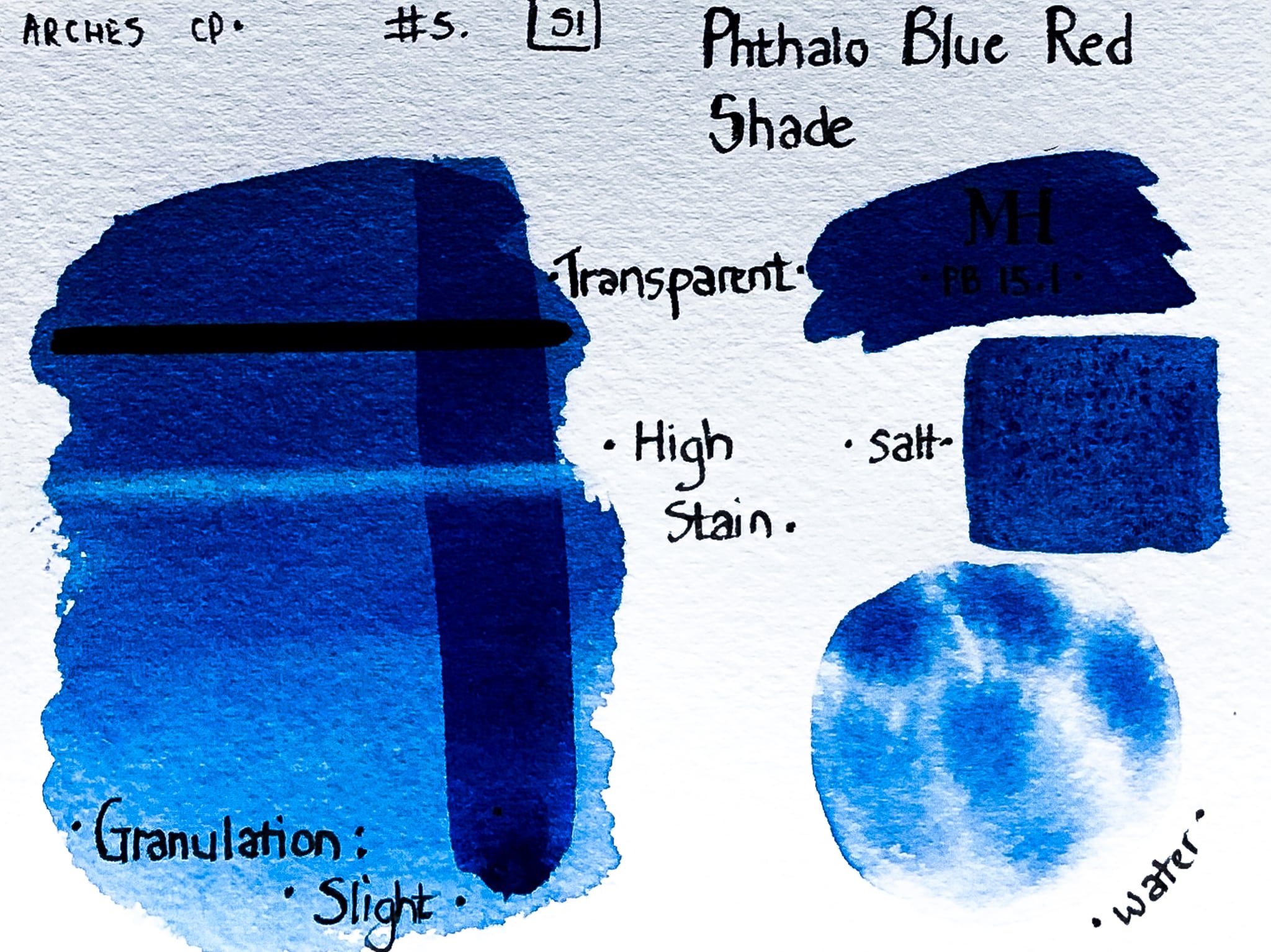
The warmer sibling. In masstone it’s closer to Prussian Blue, but thinned down it has the clean brightness associated with Ultramarine. It reaches natural, believable greens more easily than the green shade does, because the warmth in the pigment itself does some of the neutralising work for you. If you’re deciding between the two shades for a landscape palette, the general rule holds: green shade pushes a painting cooler overall, red shade pushes it warmer — pick based on the mood you’re after rather than assuming one is simply “better.”
Phthalo Green (PG7)
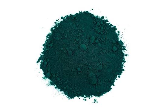
Made by chlorinating the same copper phthalocyanine base, PG7 absorbs more blue light than either Phthalo Blue variant, giving it a velvety, deep character with strong blue undertones. Its transparency and depth make it a genuinly good match for seascapes, and tinted with white it produces a range of convincing turquoises. Many landscape painters prefer mixing their own greens rather than using it straight from the tube, but adjusted with an earth colour like Burnt Sienna, its blue undertone neutralises into some surprisingly natural, deep browns.
Phthalo Green, Yellow Shade (PG36)
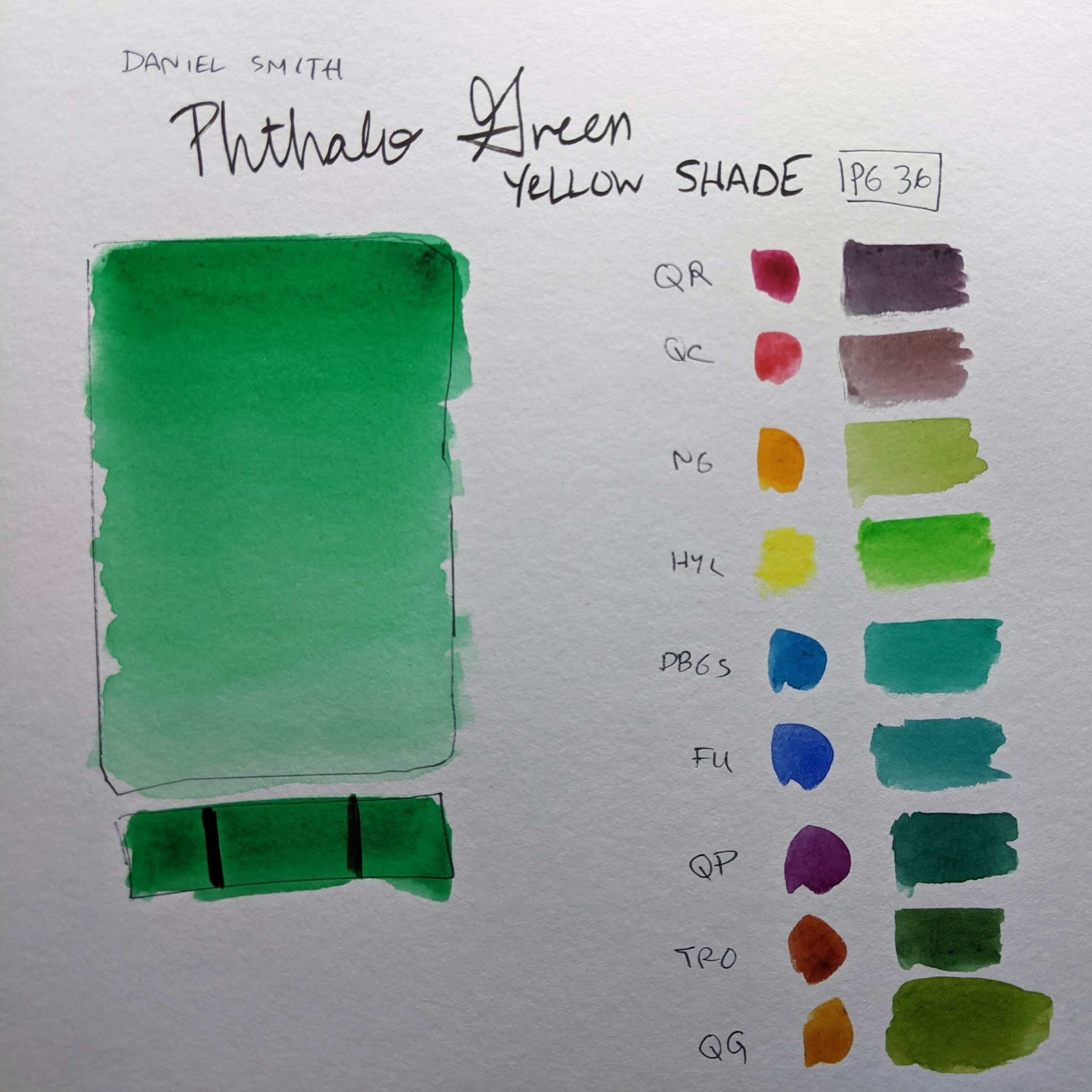
Usually priced a little higher than the other phthalo pigments, PG36 is produced by treating the same base pigment with bromine rather than chlorine. The result is a cleaner, more yellow-leaning emerald green. It shares PG7’s usefulness in a landscape palette when knocked back with an earth tone, and paired with a cool lemon yellow it produces genuinly striking, almost fluorescent greens.
Phthalo Turquoise (PB16)
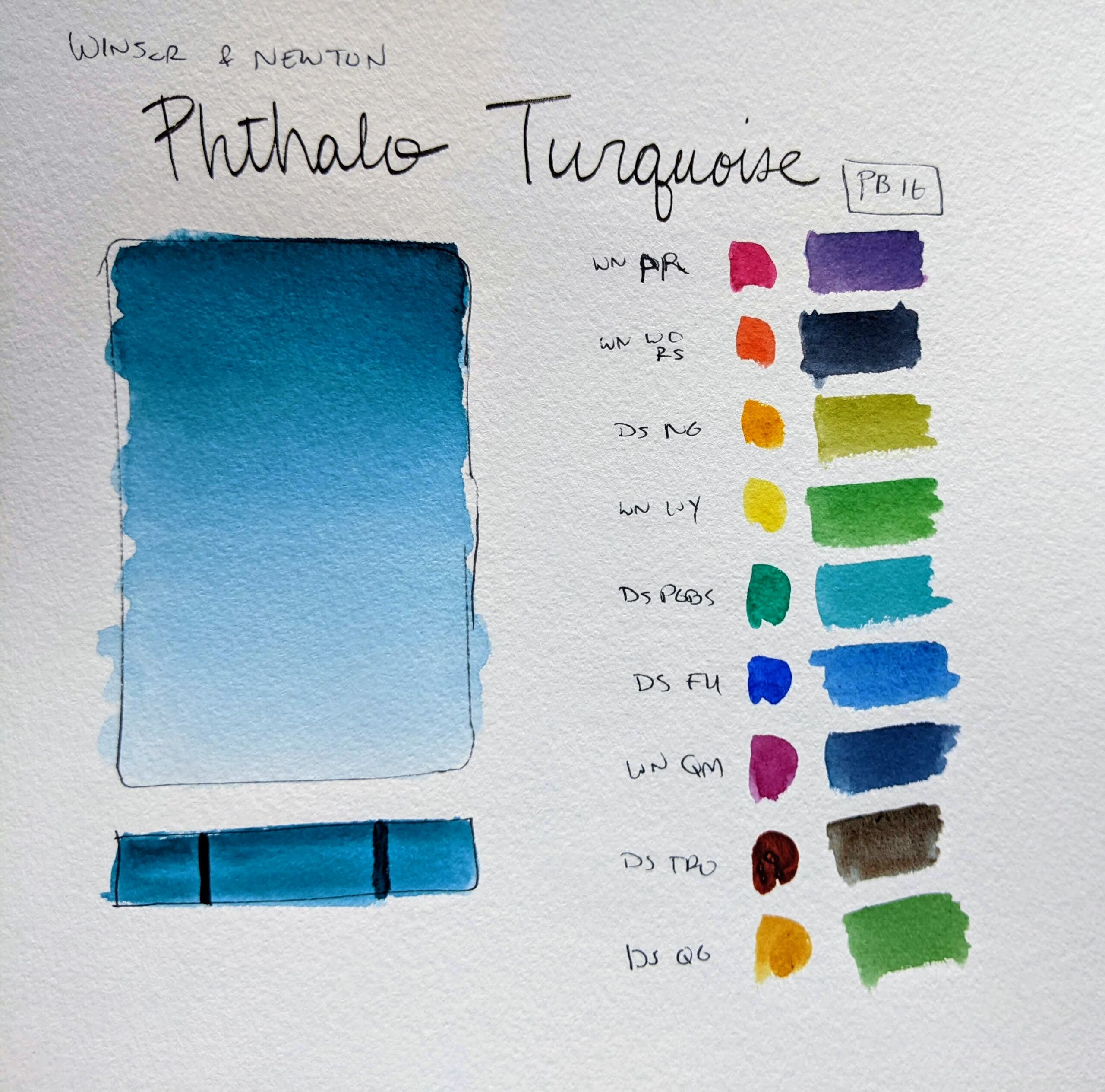
Less commonly discussed than the four pigments above, but worth knowing about. In some paint ranges Phthalo Turquoise is a straightforward blend of PB15 and PG7; in others it’s a genuine single pigment, PB16. It pairs particularly well with red-shade oranges and orange-reds, and several experienced painters rate it highly alongside Cobalt Violet for rich, unusual darks. If your usual phthalo blue or green feels like it’s fighting your palette, it’s worth trying as a standalone alternative rather than mixing your own turquoise from scratch.
Phthalo Across Different Media
Phthalo pigments behave consistantly across oil, acrylic, watercolour and gouache in terms of core colour character, but a few practical differences are worth knowing:
Watercolour: phthalos are highly staining, meaning lifting techniques that work on less staining pigments won’t fully remove them once they’ve touched the paper. Plan your washes accordingly rather than relying on correction afterwards.
Oil and acrylic: their high tinting strength means a small amount goes further than expected, and it’s very easy to accidentally overwhelm a mix by adding too much straight from the tube. Building up gradually from a tiny amount is far easier than trying to dilute an overpowering mix after the fact.
Gouache: phthalo’s natural transparency works against gouache’s usual opaque character, so some brands adjust formulation to compensate. Don’t assume a phthalo gouache will be as fully opaque as other colours in the same range.
How to Tame an Overpowering Phthalo
The single most common complaint about phthalo pigments is that they’re “too strong” or take over a mix — but this is almost always a technique issue rather than a reason to avoid the pigment entirely. A few practical fixes:
Start with a tiny amount and build up, rather than starting with an equal ratio to your other colours. Phthalo’s tinting strength means it needs a fraction of the volume of most other pigments to have an equal visual effect.
Use the complementary colour to knock it back, rather than trying to dilute it with white or water alone — a touch of red against phthalo green, or a touch of orange against phthalo blue, neutralises the intensity far more effectively.
Remember it’s much easier to start with a strong, clean pigment and mute it than to start with a dull colour and try to increase its intensity — which is exactly why so many experienced painters keep phthalo in their kit despite the initial learning curve.
Is Phthalo Safe to Use?
Yes — phthalocyanine pigments are generally considered non-toxic and are among the safer pigments on an artist’s palette, which is part of why they’re used so widely, including in applications like toothpaste colourant. As with any pigment, normal studio hygiene applies (don’t ingest paint, wash hands before eating), but there’s no specific heavy-metal or toxicity concern here the way there is with genuine Cadmium or Cobalt pigments.
Frequently Asked Questions
Is phthalo blue the same as Prussian blue? No, though they can look similar in masstone. Prussian Blue is an older, iron-based pigment (PB27) with different mixing and lightfastness characteristics. Phthalo Blue Red Shade is the closest phthalo equivalent in appearance, but they behave differently in mixtures.
Why does my green look “too synthetic”? This usually happens when mixing Phthalo Blue Green Shade with a cool yellow — the result can look acidic and artificial. Switching to Phthalo Blue Red Shade, or neutralising with a touch of red, generally produces a more natural-looking green.
Do all brands use the same phthalo pigments? The underlying pigments (PB15, PG7, PG36, PB16) are standardised by colour index number, but brands vary in concentration, particle size and formulation, which affects how vivid or granulating the paint feels even when the pigment code is identical. Comparing across ranges like Schmincke Horadam is worth doing if you’re particular about a specific shade.
Building Out Your Palette
Whichever phthalo variants you settle on, they’re a near-universal staple across watercolour, oil, acrylic and gouache ranges, so you’re not limited to one brand’s version. Our paints and mediums deals page compares current prices across the major UK art retailers, so whichever shade and brand you land on, you’re not paying more than you need to.