Written by Paul Worrall
Most colour theory guides stop at the colour wheel and a few definitions, and honestly, that’s where the useful part is only just beginning. Knowing that red and green are complementary doesn’t tell you why two different reds mixed with the same blue can produce a vivid violet in one case and a muddy grey-brown in the other. That’s the bit that actually changes your painting, and it’s the bit most guides skip entirely.
I’m Paul Worrall. I spent nearly a decade running digital marketing for ARTdiscount, one of the UK’s larger online art retailers, and I now run Discount Art Supplies — a price comparison platform used by over 41,000 UK artists every week. This is the properly thorough version: the colour wheel basics, yes, but also the mixing theory that actually explains what happens on your palette, with real pigment recommendations rather than abstract colour swatches.
Quick Picks — Building a Split-Primary Palette
- Warm yellow: Cadmium Yellow
- Cool yellow: Lemon Yellow
- Warm red: Cadmium Red
- Cool red: Quinacridone Rose
- Warm blue: French Ultramarine
- Cool blue: Phthalo Blue
What is colour theory in art?
Colour theory is generally broken into three connected areas. The colour wheel is the structural map — how colours relate to each other spatially. Colour harmony covers which combinations look pleasing together, worked out from that map. And colour psychology and context covers how colour affects mood and meaning, which shifts depending on culture and setting as much as it does on the pigment itself. Most guides only really cover the first two. The genuinely useful part for a working painter — how real pigments behave when mixed, rather than how idealised colours behave in a diagram — barely gets touched anywhere, which is the gap this guide is aimed at.
The colour wheel and where it came from
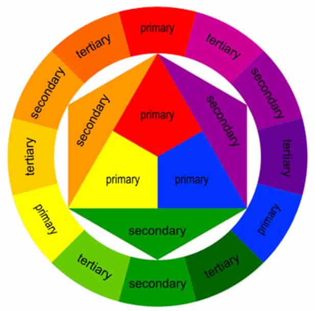
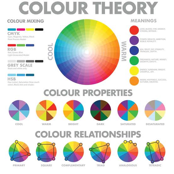
The modern colour wheel traces back to Isaac Newton’s 1666 experiments splitting white light into its spectrum, though the artist’s pigment-based wheel most of us learn today owes more to later refinements by figures like Johann Wolfgang von Goethe and, in the 20th century, Bauhaus theorist Johannes Itten, whose work on colour contrast and harmony still underpins most colour theory teaching. The traditional 12-hue wheel breaks down into:
- Primary colours: red, yellow, blue — the colours that, in theory, can’t be mixed from anything else
- Secondary colours: orange, green, violet — each made by mixing two primaries
- Tertiary colours: red-orange, yellow-orange, yellow-green, blue-green, blue-violet, red-violet — a primary and its neighbouring secondary mixed together
The main colour relationships
Complementary colours
Colours sitting directly opposite each other on the wheel — red and green, blue and orange, yellow and violet. Placed side by side, they create the strongest possible contrast and visual vibration. Mixed together, they neutralise each other into greys and browns, which is a genuinely useful property for toning down a colour that’s too bright, not just a limitation.
Analogous colours
Three colours sitting next to each other on the wheel — blue, blue-green, green, for example. These read as naturally harmonious, which is largely why they turn up so often in landscape painting; nature tends to arrange itself in analogous colour groups.
Triadic colours
Three colours evenly spaced around the wheel, such as red, yellow and blue. Triadic schemes give strong, vibrant contrast while still holding together as a set, because the spacing is mathematically balanced.
Split-complementary
Instead of a colour and its direct opposite, you pair it with the two colours either side of that opposite. This keeps a good deal of the contrast of a true complementary pairing with a bit more flexibility and slightly less visual tension.
Monochromatic
A scheme built from a single hue, varied only through tints, shades and tones. It’s the easiest scheme to get right as a beginner because nothing can clash — there’s only one colour to manage — and it’s a genuinely underrated way to build confidence with value and contrast before introducing multiple hues.
Warm and cool colours
Warm colours — reds, oranges, yellows — read as energetic and advancing, tending to come forward in a composition. Cool colours — blues, greens, violets — read as calm and receding, useful for pushing background elements away from the viewer. This single principle does most of the heavy lifting in creating a convincing sense of depth and atmospheric perspective in a painting, well before you even think about actual perspective drawing.
Colour bias: the part most guides leave out entirely
This is genuinely the most useful thing you can learn about colour theory as a painter, and it’s almost never covered properly. No real pigment is a pure, textbook primary — every one of them leans slightly toward a neighbouring colour on the wheel. This lean is called its colour bias, and it completely determines what happens when you mix it with something else.
Take blue. French Ultramarine leans slightly toward red — thin it out as a glaze and you’ll see a violet cast. That makes it a warm blue. Phthalo Blue and Cerulean, by contrast, lean slightly toward green, making them cool blues. The same applies to reds and yellows: Cadmium Red leans warm (toward orange/yellow), while Quinacridone Rose or Alizarin Crimson lean cool (toward blue/violet). Cadmium Yellow leans warm, Lemon Yellow leans cool.
Here’s why it importent matters in practice: mix two pigments with matching bias, and you get a clean, vibrant secondary colour. Mix a cool blue with a cool-leaning yellow and you’ll get a bright, clear green. But mix pigments with opposing bias — say, a warm, red-leaning blue with a warm, red-leaning yellow — and you’ve unintentionally introduced a third primary into the mix, which mutes and dulls the result into something more like an earthy, greyed-down green. Neither result is “wrong” — sometimes you want a muted, natural green rather than a bright one — but knowing which pigments will give you which effect turns colour mixing from guesswork into a decision.
Building a split-primary palette
Once you understand bias, the smartest palette isn’t three primaries — it’s six: a warm and a cool version of red, yellow and blue. This is called a split-primary palette, and it lets you choose the matching-bias pair whenever you want a clean, vibrant mix, or the opposing-bias pair whenever you want something more muted and natural.
A solid starting split-primary set: Cadmium Yellow (warm) and Lemon Yellow (cool); Cadmium Red (warm) and Quinacridone Rose (cool); French Ultramarine (warm) and Phthalo Blue (cool). With just those six pigments, plus white, you can mix a genuinely enormous range of secondary, tertiary and neutral colours — which is a significent step up from what a basic three-primary starter set can achieve, and it’s usually far cheaper than buying a large box of pre-mixed colours you’ll rarely use up.
🛒 Buy a Split-Primary Set on Amazon 🔍 Compare Prices
Tints, shades and tones

- Tint: a colour mixed with white — lighter and often softer
- Shade: a colour mixed with black — darker and richer
- Tone: a colour mixed with grey (black and white together) — muted and more naturalistic
Controlling tints, shades and tones is what gives a painting real depth and believable light, well beyond what hue alone can achieve — a painting built from a narrow range of hues but a wide range of tones will often read as far more sophisticated than one using many hues at a single, flat tone throughout.
How colour psychology fits in
Colour carries meaning, but that meaning is far less universal than most short guides suggest — it shifts by culture, context and individual association. Broadly, in Western contexts red tends to read as passion, urgency or warning; blue as calm, trust or melancholy; yellow as joy or energy; green as growth or nature. These associations are worth knowing, but treat them as a starting point rather than a rulebook — the specific colours you choose, their saturation and their relationship to what surrounds them will always matter more than a single hue’s supposed universal meaning.
Practical tips for applying all of this
- Start with a split-primary palette rather than buying dozens of pre-mixed tubes — you’ll learn mixing far faster and understand your colours properly
- Make a bias chart for your own palette — mix every pigment against every other and keep it as a reference; it’s more useful than any generic colour wheel because it reflects your actual paints
- Limit your palette on a given painting — fewer colours, chosen deliberately, almost always reads as more cohesive than an unlimited palette used indiscriminately
- Use complementary underpainting — a thin base layer in a colour’s complement adds a subtle vibrancy to everything painted over it
- Test mixes on scrap paper first, always, before committing to the painting itself
FAQ
What are the three types of colour theory?
Colour theory is generally broken into three areas: the colour wheel (how colours relate to each other spatially), colour harmony (which combinations look pleasing together, such as complementary or analogous schemes), and colour psychology or context (how colour affects mood and meaning, which varies by culture and setting).
What is colour bias and why does it matter?
Colour bias means every real pigment leans slightly toward a neighbouring colour rather than being a pure, textbook primary. A blue might lean slightly toward red or slightly toward green, for example. This matters because mixing two pigments with matching bias produces clean, vibrant secondary colours, while mixing pigments with opposing bias produces duller, more neutral results — useful when you want either effect.
What is a split-primary palette?
A split-primary palette uses two versions of each primary colour — a warm-biased and a cool-biased red, yellow and blue — giving six colours instead of three. This lets you mix noticeably cleaner, more vibrant secondary colours than a basic three-colour primary set, because you can always choose the pair with matching bias for the mix you want.
Do I need to buy every colour, or can I mix them?
A well-chosen split-primary palette of around six to eight pigments can mix the vast majority of colours you’ll need, including secondaries, tertiaries and a wide range of neutrals and earth tones. Buying every pre-mixed colour is convenient but expensive and unnecessary once you understand colour bias and mixing — though many painters still like to keep a few convenience colours (like a good black or a specific earth tone) on hand.
Understanding colour bias is genuinely the single biggest jump most painters can make in their mixing — it’s the difference between hoping a mix works and knowing it will before your brush touches the palette. As always, check Discount Art Supplies before you buy paint — we compare prices across major UK retailers in real time, so you’re getting the best deal on whichever pigments you choose.